
Analytics
# The Black Box Behind Every Dashboard - and What Happened When We Opened It
Par Edgars Puķītis · 26 août 2026

# The Black Box Behind Every Dashboard - and What Happened When We Opened It
Dashboards put a black box between people and the data behind them: reliable, until what someone needs don’t match what was built. My colleague Toms Vesperis and I gave an AI agent governed, identity-aware access to our CRM's semantic model to see what changes when someone can just ask. My honest verdict: it caught data quality problems nobody had flagged and answered questions no dashboard was ever built for - but the default output isn't always quite the shape you need, and how much to trust an ad-hoc answer is a real open question. This isn't a dashboard replacement yet. It's a serious new layer on top of one.
A dashboard can only answer the questions someone predicted.
I've been building dashboards for years, and that has always been a limitation by design - the report creator prepares a report, and users work with what is available. Unfortunately, that doesn't cover every need.
For end users the report and the data can feel like a black box, with limited ad-hoc analytics options, no clear answer to how things are calculated, or how healthy and fresh the data is. All of these are real obstacles to effective data use.
So, can we cover this part with AI?
Where this started
Building a dashboard is a serious investment on both sides, the client's and the developers. The warehouse and the semantic model are the foundation, and they aren't going anywhere. But the dashboard is the visible layer, and the visible layer is never finished. The real build is followed by additions, adjustments, new angles. It's rarely quick. That's what I see as the core problem with the classical report building approach.
What we tried
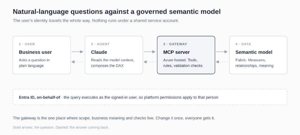
Together with a colleague (Toms Vesperis), we built an MCP (Model Context Protocol) server on top of a Fabric semantic model and pointed it at CRM opportunity data in our DEV environment. Authorization runs through Entra ID with on-behalf-of, so a query executes under the user's identity rather than a shared service account.
If MCP is new to you: it's an open standard for how an AI agent reaches external tools and data. The MCP server is your own code that exposes those tools, plus the guidance, rules, and metadata that make the AI work with your data the way you intended.
The finished thing is compact - a few hundred lines of code. Templates exist publicly for all sorts of scenarios, and Microsoft now has its own Power BI MCP server in preview. But it takes real technical judgment to get right, because around those few hundred lines sit authentication, authorization, data security, and a service that must behave inside a live user interface. This isn't the place to rely on vibe coding.
Here's the architecture ours took - not a generic template, but the actual pattern behind what we built: a business user asks a question in plain language, Claude reads the model's context and composes the query, and the MCP server sits in between as the gateway that carries the request to the semantic model and the answer back. The part that matters most is at the bottom of the diagram - the user's own identity travels the whole way through, so nothing runs under a shared service account, and existing platform permissions apply to whoever's asking.
What surprised me
My colleague Toms Vesperis had added several simple data validation rules in Fabric, writing the results into a separate table. That was just a standard part of the DWH/BI solution - not metadata or a resource prepared for the MCP server. Then I asked the first, deliberately vague question: describe the current opportunity situation. It gave me an accurate status of the opportunities and, more interestingly, it picked up those validation results on its own, unprompted:
Which opportunities are missing data in important fields.
How many open ones haven't been touched in a while.
Where one field contradicts another: the estimated close date has passed, but the status was never updated.
The answer came back at record level, with specific things to act on.
Data quality pages aren't rare, of course. But someone must define them, and they never do more than what was built into them - usually the critical minimum, rather than whether the whole process is being followed.
Here, a few generic rules arrived unasked, folded into the answer to an ordinary business question. The AI proactively flagged what nobody had asked about - data quality and process discipline enforcing themselves, the invisible groundwork you'd otherwise have to fix before reporting is even a meaningful conversation.
When I asked what it could tell me about the number of opportunities, it moved freely across all related dimensions and data. Users don't need to understand the data model, analysts don't need to build dozens of layout variations, and it still delivers exactly what's needed.
Where it stopped
The same output that was exactly right a moment ago turned out to be wrong for the next question.
When I asked for the overall picture, I got a paragraph of summary text followed by a top-N list of individual records. What I wanted was an aggregated view first, a more granular breakdown second, and individual records third - or only on request. This is the core advantage predefined visualizations still have: a standardized default view, with no need to formulate a question at all.
I suspect much of this comes down to our MCP server's current setup rather than the limit of the approach itself. The version I'd want would speak through the company's agreed reporting definitions by default and go into detail only when asked.
On trusting the answer
The usual objection: how does a user know an ad-hoc answer is correct?
Honestly, that confidence is partly an illusion in a classic dashboard too. If there's a data quality issue or a silent data load problem, an end user has little chance of spotting it. And even after a long, careful build, an analyst's understanding of a metric can differ slightly from the end users.
Two things help here. The server connects to the semantic model rather than to source data, so measure definitions are available and open to everyone. And you can ask the answer to explain itself - what the metric includes, what conditions were applied, how the number was calculated. For end users consuming data through BI tools, that explanation is normally missing entirely.
And then there's data security, which in practice tends to be a harder blocker than the technology. That deserves its own post.
Where I've landed
What surprised me most wasn't the SQL or the DAX. It was how much of the data the tool understood without extra enrichment, and how much more it made possible compared with a dashboard.
A dashboard sits between the user and the data, and behind it, the data is a black box. The user sees a final number with limited ways to ask how it was built, what conditions went into it, or whether the records behind it are in decent shape. And when the number isn't quite the shape they need, the question that comes back is always the same one: how do I export this to Excel?
That barrier is what the MCP server approach removes. The dashboard still provides a standardized view of how to consume the company's data.
For plenty of organizations, dashboards will stay in the base layer for a while, and I'm not going to walk into a project proposing we drop them. But I will be putting this on the table alongside them, and I'll be looking at every project through this lens from here on.
My recommendation: don't drop your dashboards but stop treating them as the last word on your data. Give an AI agent read access to the same governed semantic model - same permissions, same measure definitions - and let people ask what they want to know. If you're scoping a Fabric or BI project next, this is worth testing before the dashboard quietly becomes the only interface anyone remembers to build.